B2B Sales ERP Module
The sales heart of an ERP suite, quotes, orders, preparation, delivery, and returns for professional clients, structured into one readable, data-dense workspace instead of a pile of fragmented tools.
Professional sales lived in fragments
Managing B2B sales (clients, quotes, orders, invoices, deliveries) meant hopping between disconnected tools. Nobody had one place where the state of a sale was simply visible.
Fragmented data, no visibility
Client records, orders, invoices, and delivery states were scattered across several tools. Keeping a consistent picture of one sale required manual cross-checking, and trust in memory.
Density that buried the signal
Sales screens are inherently heavy: tables, filters, statuses, and relationships between entities. The metrics people actually needed were buried under repetitive information.
No shared layout rhythm
Existing screens lacked a unified structure, each one solved its own layout its own way. Every new screen made the system harder to read, not easier.
The designer between the rules and the screens
I owned the design of the module end-to-end: turning business rules and data models into flows, layouts, and screen structures the whole team could align on, and refine together as the build took shape.
Owned by me
- The full UX and UI of the sales module, 4 flows, 8 core screens, 50 frame states
- Mapping functional requirements into visual flows and screen structures with the BA
- The three-zone layout system and the data hierarchy inside every table
- Surfacing business rules in the interface, validations, guardrails, and edge-case states
- Short review-and-revision cycles with the BA and developers, from v1 to v9.1
The team around me
- Business analyst, user research, business rules, and requirement documents
- Technical lead: data models and technical constraints
- Front-end & back-end developers, implementation partners in every cycle
Collaboration ran in short, direct loops, layout reviews with the BA, data-behaviour discussions with the developers, adjustments straight back into Figma.
Three moves, made in loops
This was never a tidy waterfall. Three moves (see the whole pipeline, structure before polish, and iterate with the team) ran alongside each other, and I looped back to each as the module took shape. They're less a sequence than the three things I kept doing.
See the whole pipeline
With the business analyst I translated requirement documents and business rules into visual flows: how a quote becomes an order, how an order is prepared and delivered, how a return comes back. Four end-to-end flows emerged, and one pipeline that connects them.
My call → make the pipeline itself clickable, not just visible. A persistent stepper (Quote → Order → Preparation → Delivery → Invoice) lets you jump straight to any stage: click Invoice from the Delivery screen and you land in Finance & Accounting, where invoicing actually lives. The sales flow never feels cut off.
Structure before polish
I kept the screens deliberately at mid-fidelity: layout logic, structure, and readability over visual decoration. A limited set of brand colours (blue, gray, white) kept the screens familiar without pretending a design system existed where none did yet. Every hour went into hierarchy, contrast, and composition.
The principle → polish can't fix an unreadable table. If the structure doesn't work in gray and blue, it won't work in anything.
Iterate with the whole team
Each layout ran through a three-step loop: the business analyst reviewed it against the business rules, I revised the design accordingly, and then the developers refined it against the data models and technical constraints. Nine versions later, the structure had survived contact with every rule and edge case the team could throw at it.
What v9.1 means → not indecision, validation. Every version is a full loop: BA review, design revision, then developer refinement, absorbed back into the structure.
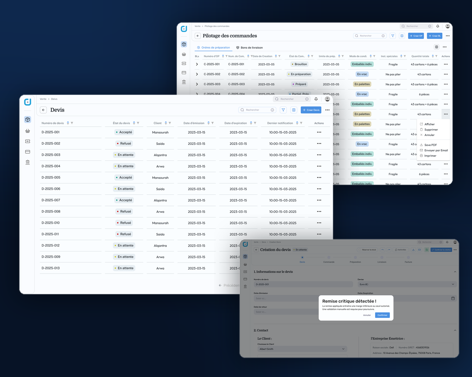
Business rules, made visible: the flows don't just display data, they defend it. A discount that pushes the margin below the authorized threshold stops the quote and demands explicit confirmation, incomplete documents and exceeded order limits get the same treatment. The interface carries the company's rules, not just its records.
Three zones for every screen
High-volume data needs a stable stage. Every screen in the module (whatever the flow) is built on the same three-zone structure, so users always know where to look and where to act.
Navigate the sales world
Compact, icon-driven navigation between the module's sections, always present, never competing with the data for attention.
Where the data lives
Dynamic tables and lists carrying the real volume, per-column sorting and filters, global filters, line actions, and pagination built for thousands of records.
Context and quick actions
The document's identity, its state in the pipeline, and the actions that matter now (create, validate, send, print) one click from anywhere.
Quote → Order → Preparation → Delivery → Returns
One sale, many hands: the commercial team drafts the quote, the warehouse prepares, logistics delivers, and sometimes goods come back. The module follows the document through every hand-over, and the stepper keeps everyone oriented.
Where it starts: building a quote
Through the warehouse: order to doorstep
Down to the paperwork
The flow doesn't end at the screen, preparation orders, delivery notes, and return notes were designed as printable documents too, so the same information stays legible on paper in a warehouse aisle.
A note on what's shown: this is live client work under NDA. Every screen uses placeholder content (the repeated clients, dates, and amounts are intentional dummy data), and some flows are simplified. The real product and its data stay private.
What it delivered
The module's job was to make complex sales operations readable and buildable, and to leave a structure the rest of the ERP could stand on.
Complex data, readable at last
Large volumes of sales data organized into a clear, navigable hierarchy, users locate and interpret dense information without wading through it.
A validated structure, ready to build
The mid-fidelity prototype defines layout logic, user flow, and data hierarchy across all four flows, confronted with business rules and data models for nine versions, and ready for visual refinement.
Business rules in the interface
Margin guardrails, completeness checks, and order limits are part of the flows themselves, the design catches costly mistakes before they become documents.
The blueprint for the suite
The three-zone structure became the layout foundation for the ERP's other modules (Purchase, Finance, and Accounting), keeping the suite consistent at the system level.
Validated, adopted, moving to hi-fi
Structure validated
All four sales flows validated at mid-fidelity with the business analyst, technical lead, and developers, v9.1 is the version the team builds against.
The suite follows
The module's layout logic now carries the wider ERP, I went on to design the Purchase and Finance & Accounting modules on the same structure.
Visual refinement
With the structure proven, the screens are ready for the high-fidelity pass, full visual polish applied on top of a layout that already works.
At mid-fidelity, structure is the design. If the hierarchy doesn't work in gray and blue, no amount of polish will save it.
This project sharpened how I design data-heavy interfaces: readable hierarchy first, high contrast between content and actions, and compositions that stay calm under hundreds of rows. It also proved that consistency doesn't have to wait for a design system, a well-structured layout and a disciplined visual language carried four modules.
And it confirmed a way of working I trust: sit between the business analyst and the developers, treat their rules and constraints as design material, and iterate in short cycles until the structure survives everything the domain throws at it.
Drowning in data-dense screens?
I design the interfaces behind heavy operations (ERP modules, dashboards, internal tools), and the structures that keep complex data readable. Tell me what your team is wrestling with.
Let's build something like this