Task Master
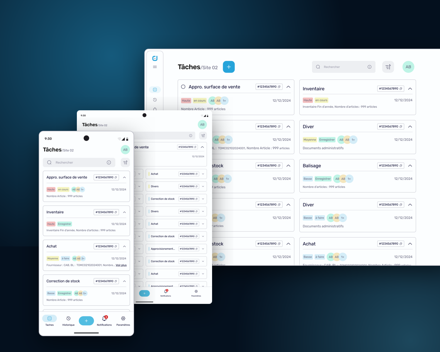
A task-management app for retail store teams, purchasing, inventory, stock corrections, and shelf operations turned into one clear, scannable workflow across mobile, tablet, and desktop.
Store operations ran on spreadsheets and memory
Retail teams coordinate a store's daily operations (receiving purchases, counting inventory, correcting stock, relabelling shelves) on their feet, on shared devices, against the clock. The tooling didn't match that reality.
Scattered tools, invisible progress
Operations lived in manual spreadsheets and disconnected tools. Every store ran the same tasks its own way, and nobody could see the state of the work without asking someone.
One task, many moving parts
A single stock correction touches zones, articles, quantities, reasons, and validation. Switching between tools mid-task is where the errors crept in, and errors in stock data are expensive.
The first version taught us
The first-generation app (which I also designed) proved the concept but exposed hard lessons: inconsistent visuals, weak responsiveness, and screens that asked floor workers to read when they needed to act.
Sole designer, embedded in the operation
I was the only product designer on this product. I worked directly with the business analyst who owned the requirements, and with the engineers who shipped it, everything visual or interactive crossed my desk.
Owned by me
- End-to-end UX and UI for all six workflows, on mobile, tablet, and desktop
- Translating functional documents into task flows, wireframes, and data hierarchies
- The unified task model the whole app is built on
- The design system, colour, type, spacing, icons, and the component library
- Dev-ready Figma specs and the continuous iteration loop with the developers
The team around me
- Business analyst, requirements, domain knowledge, end-user feedback
- Technical lead: feasibility and interaction logic
- Mobile, front-end & back-end developers, implementation partners
- Stakeholders: priorities and review cycles
Collaboration was direct and continuous, Figma versions, Teams calls, short review loops. No formal sprints, no waiting.
From the shop floor to the screen
The work moved in loops, not a line, but each pass had a centre of gravity: understand the operation, model it, then iterate it against reality.
Understand the operation
With the business analyst I ran visualization sessions that turned functional documents into task flows, wireframes, and data hierarchies, starting on paper. Before any UI, I needed to know what a worker actually holds, scans, counts, and confirms in each operation.
My call → design for the worker's context first (standing, one-handed, on a shared device, interrupted constantly), and let every layout decision follow from that.
One task model for six workflows
Purchasing, inventory, shelf labelling, stock correction, sales-floor replenishment, and ad-hoc tasks all behave differently on paper. I structured every one of them into the same three layers, a task list with filters, a task detail with its people and data, and an execution view with direct in-task actions. Learn the app once, and every operation feels familiar.
The decision that mattered → one model, not six mini-apps. It's what made the app scalable to new modules and instantly learnable for new staff.
Iterate against reality
Screens went to the developers and to usability tests with real supermarket users, and their feedback came straight back into Figma, clearer specs, tighter spacing, better data rendering. The redesign measured 50% faster inventory task execution than the old flows, and shared testing sessions kept design and engineering honest with each other.
The principle I held → a spec is a conversation, not a handoff. Short direct loops with four developers beat any formal process we could have run.
The loop in action: after release, field reality pushed us further: floor workers wanted to drive whole operations from the barcode scanner. That became a dedicated scan-first variant of the task flows, 47 screens designed around the scanner as the primary input, not the keyboard.
Where it started: paper and lo-fi
Same operation, a generation apart
The second iteration rebuilt every screen on the new foundation: a calmer surface, a stronger hierarchy, and task cards that surface priority, status, assignees, and article counts at a glance, so the list itself answers most questions.
Before: first generation
After: Task Master
A note on what's shown: this is live client work under NDA. Every screen here uses placeholder content (the repeated IDs and “999 articles” are intentional dummy data), and some flows are simplified. The real product and its data stay private.
List → Details → Execution
Every workflow (from a year-end inventory to a single shelf relabel) moves through the same three layers. The layers stay identical, only the data inside them changes.
See the work, not the tool
All tasks in one place with search, filters, and sorting. Priority, status, team, and scale are readable without opening anything.
Everything the task knows
Who's responsible, current status, related documents and articles, the full context of one task, structured the same way in every workflow.
Act without leaving the task
Direct in-task actions (count, correct, scan, validate), with the scanner as a first-class input. The task closes where the work happens.
A design system grew out of the product
Six workflows on three breakpoints can't stay consistent by discipline alone. So alongside the app I built Datamaster's design system (colour, type, spacing, icons, and a full component library), and the second iteration of Task Master was assembled from it.
Tip: click any swatch to copy its hex, the brand's real palette, built around the logo's blue.
Underneath: ten-step ramps for every colour role plus four support palettes, a Material-aligned type scale on Rubik with a handwritten accent face for annotations, an 8-px spacing rhythm, five responsive breakpoints, and an icon set redrawn from Streamline's Solar Linear style to match the brand, in five sizes, from 12 to 48 px.
From the component library
In the library
Why it matters here: the system is the quiet hero of the 50% result: consistent components made the redesign fast to assemble, easy for developers to reuse, and instantly familiar from screen to screen. It now serves as the visual reference for Datamaster's wider ERP modules.
What it changed
The redesign was validated where it counts (with real supermarket users doing real operations), and in the day-to-day speed of the team building it.
50% faster inventory task execution
In usability tests with real supermarket users, the redesigned flows cut inventory task time roughly in half, clearer hierarchy, fewer steps, and no tool-switching mid-task.
Fewer errors where they hurt
Stock corrections and order tracking (the two places where a mistake costs real money) saw reduced error rates once the flows guided the work step by step.
Developers shipped faster
Reusable components and dev-ready specs cut rework and kept implementation faithful to the design, the developers' own words, not mine.
The benchmark for the suite
Task Master became the reference for how Datamaster's future ERP modules should look, feel, and be built, the app that proved the foundation.
Shipped, in use, still growing
Redesign shipped
The second-generation app is what retail teams work with today, across mobile, tablet, and desktop.
New modules in design
Purchasing and inventory keep deepening, and the scan-first flows came out of this loop, the field keeps teaching us.
Multilingual rollout
French, English, and Arabic support is rolling out across Datamaster's products, starting with this app.
The complexity lives in the operation. The interface's job is to absorb it, not pass it on.
The hardest part of this project wasn't drawing screens, it was compressing a messy, physical, interrupted operation into a model a tired worker can trust at 7 a.m. Getting the task model right early is what let six very different workflows ship as one coherent product, and what makes the next module cheaper than the last.
It also settled how I want to work with engineers: no ceremony, short loops, specs treated as conversations. And it taught me that a redesign is strongest when you designed the first version too, you're not guessing at what failed, you measured it.
Have an operation to untangle?
I design the interfaces behind heavy operations (ERP modules, internal tools, mobile-first workflows), and the foundations that keep them consistent. Tell me what your team is wrestling with.
Let's build something like this